Collecting and Presenting - Happiness Index - Azim Premji University, Bhopal

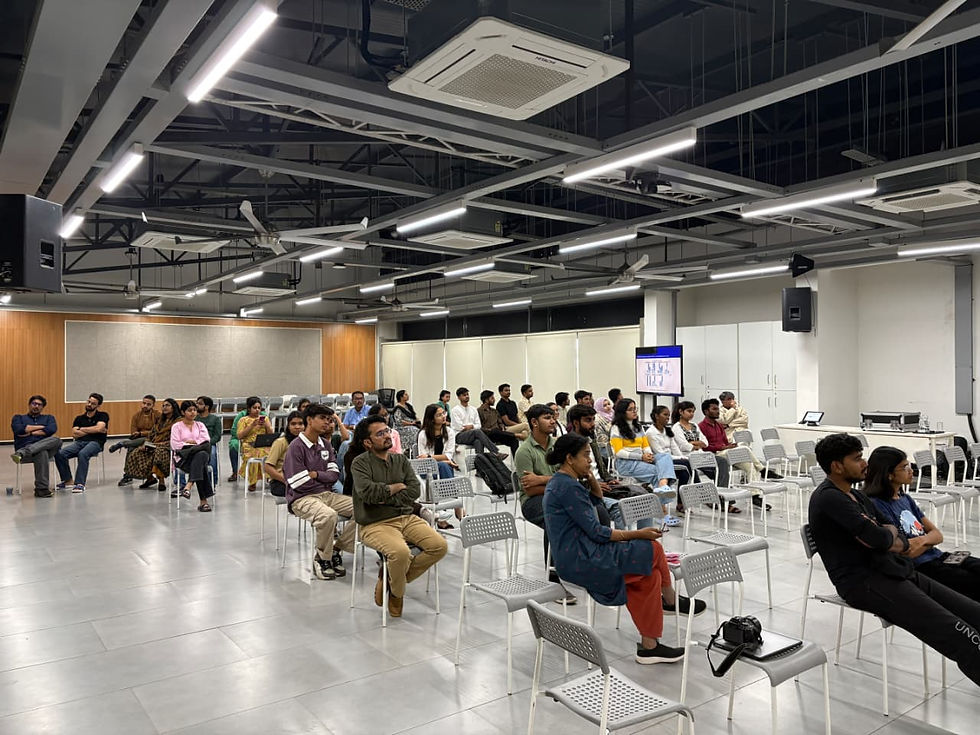
On November 7, we presented the Happiness Index of our university, and I was also a member of the team.

For this study, we collected data from university students through a Google Form. We tried to capture several aspects such as the personal, social, and mental well-being of both students and faculty members of our university.
Our key findings were quite interesting. For the presentation, we used stacked bar plots and aggregated the data using R Studio to create graphical representations. I contributed by writing the plotting code, and we also added aesthetic elements to make the visuals more appealing.

At the end of the event, we received valuable suggestions from faculty members on how we could further improve and enhance our research—both in terms of presentation and content.
This was a small research project for me, but it was extremely helpful. I learned how to collect primary data on the ground in real-life settings, and since we had qualitative responses as well, I learned how to refine them without changing any original words or primary sources.
The entire process—from data collection to presenting the key findings—took around three months, and it was a wonderful experience for me.


Comments